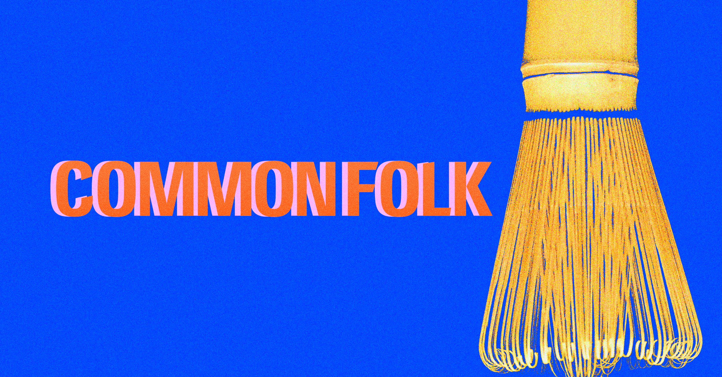
Common Folk
Common Folk is centered around community and aims to bring people together in Santa Ana, California. The brand identity takes a colorful, expressive approach that contrasts with the muted minimalism often associated with matcha. Bold typography, risograph-inspired colors, and playful graphics come together to create a striking and recognizable visual system across print and digital media.
Client Project
Role:
Brand Identity, Art Direction, Print Design, Social Media Content
Deliverables:
Logo, Signage, Menu Design, Collateral, Social Assets
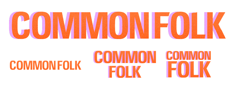
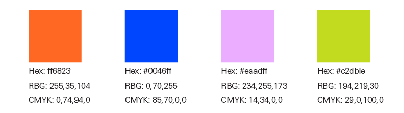
The brand direction combines a clean, minimal design with playful retro-inspired details, using bold typography, vibrant colors, shadow, and grain to create an energetic and approachable identity.
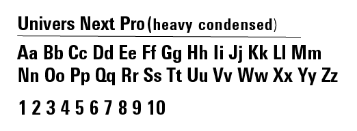
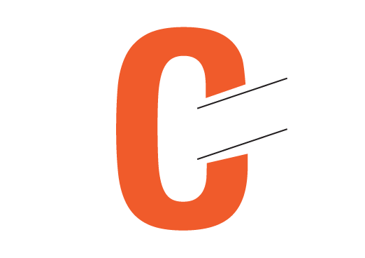
A bold condensed typeface is used for the wordmark logo, while custom diagonal cuts add a distinctive detail to the brand’s typography.
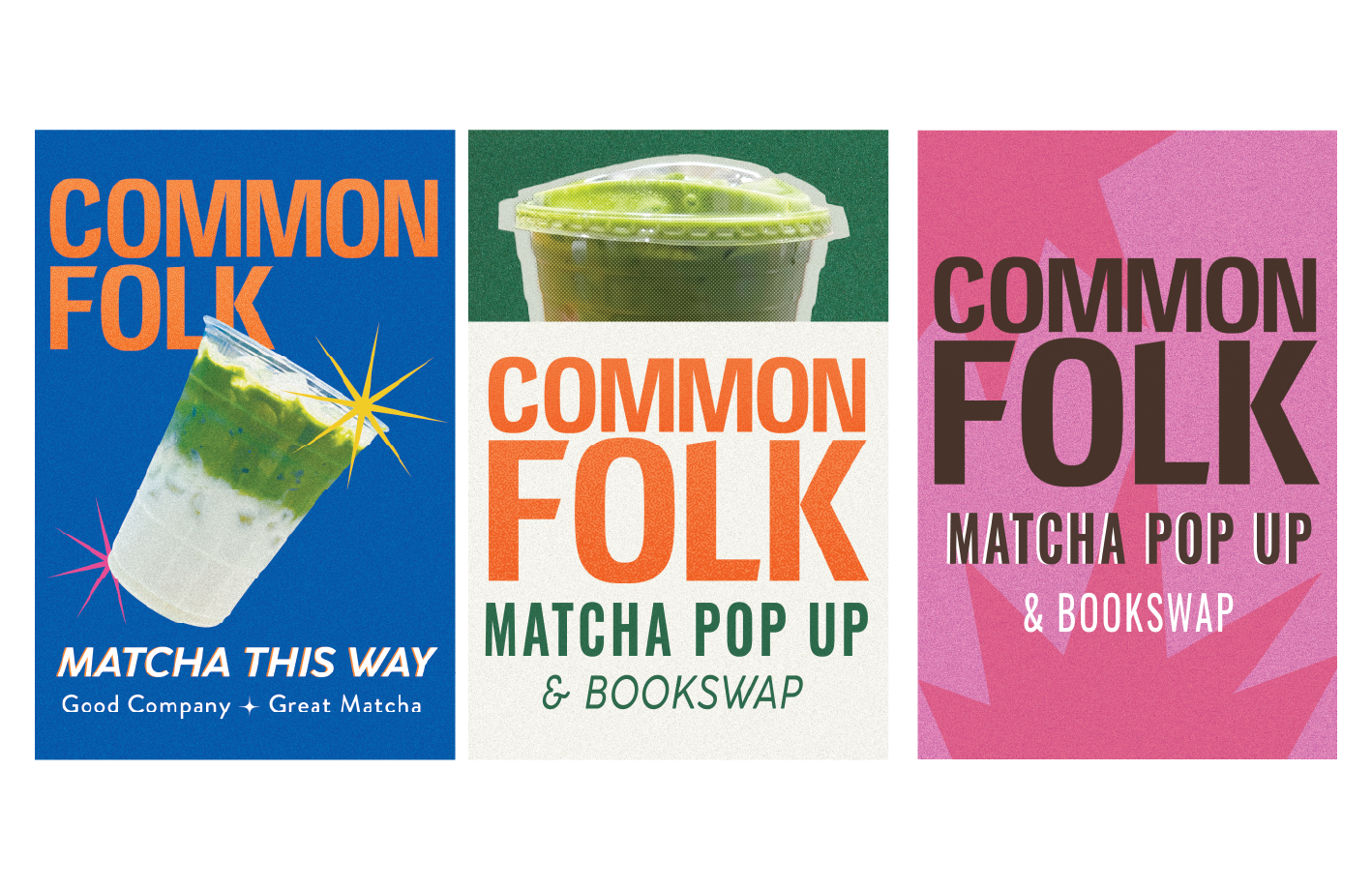
Poster Prints
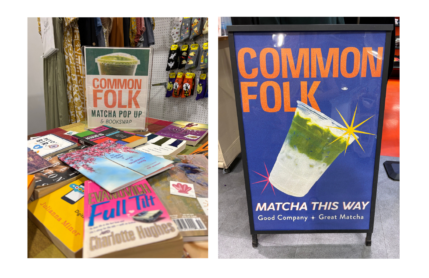
The poster series expressed the brand identity through oversized typography, bold color combinations, and playful compositions designed to stand out within the pop-up environment.
Business and Loyalty cards
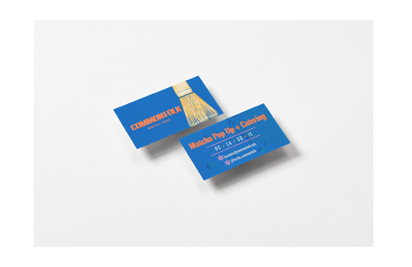
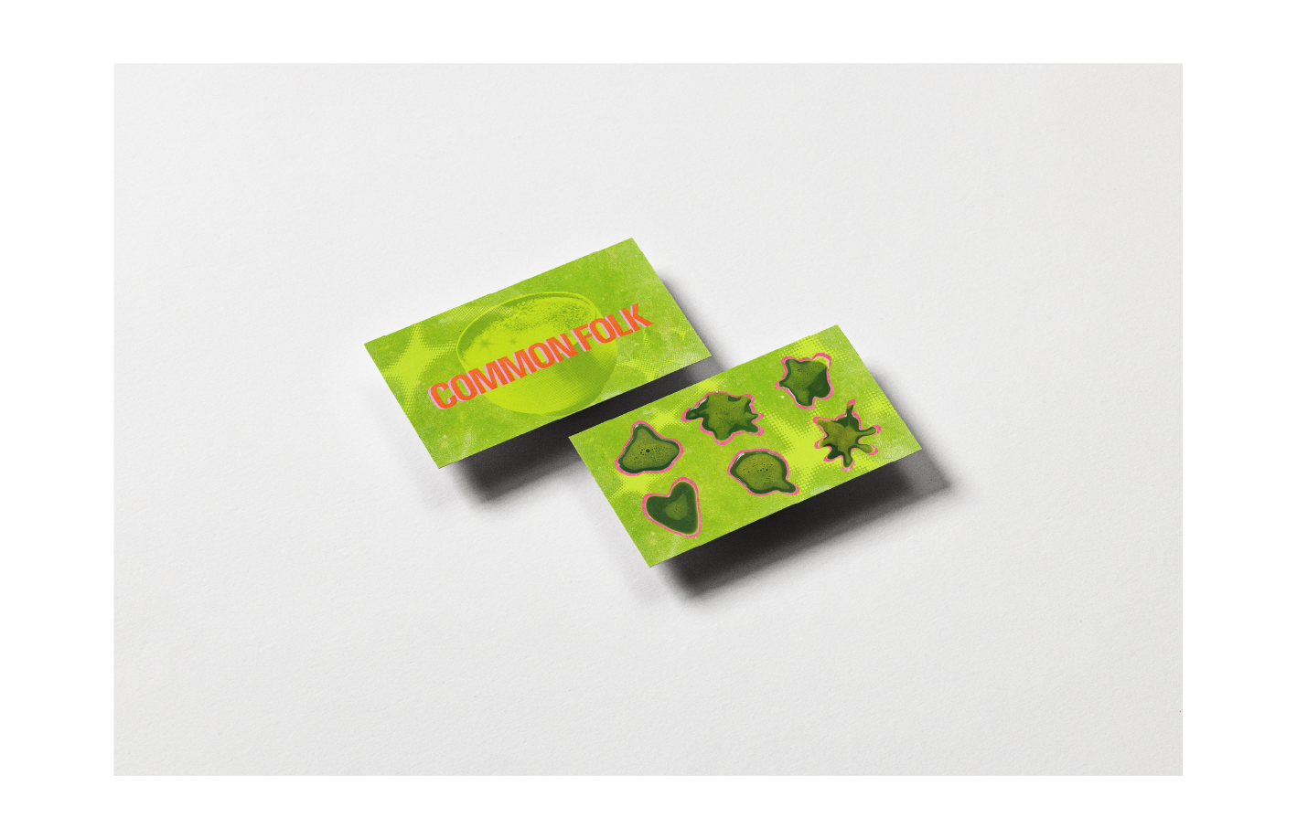
Small-format prints extend the visual identity with the same bold typography, color, and graphic style.
Menu Design
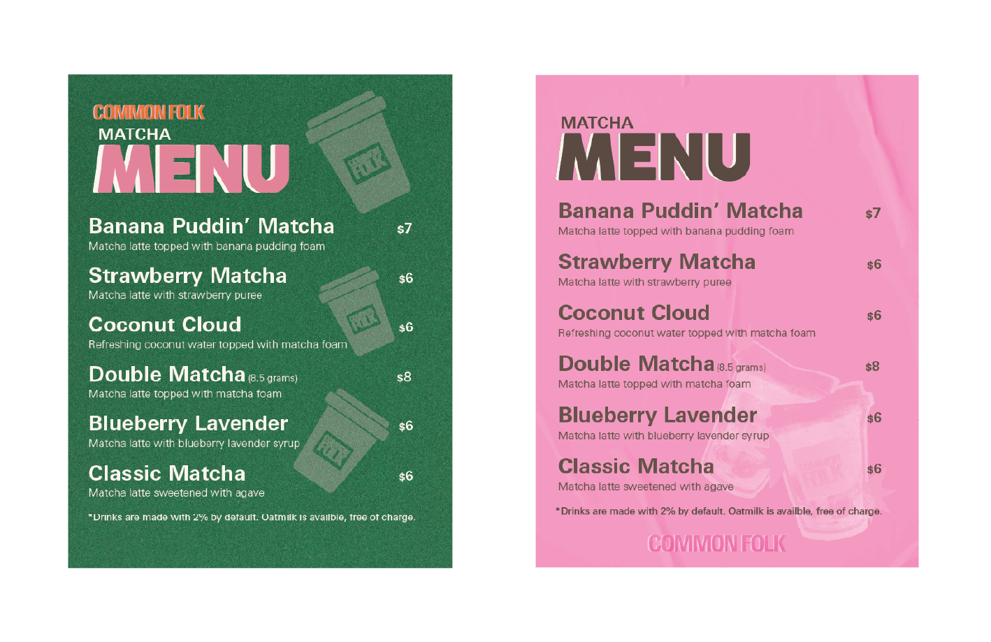
The menu balances personality with a clear information hierarchy, making it easy for customers to scan while visually connecting to the consistent visual design.
Social Media
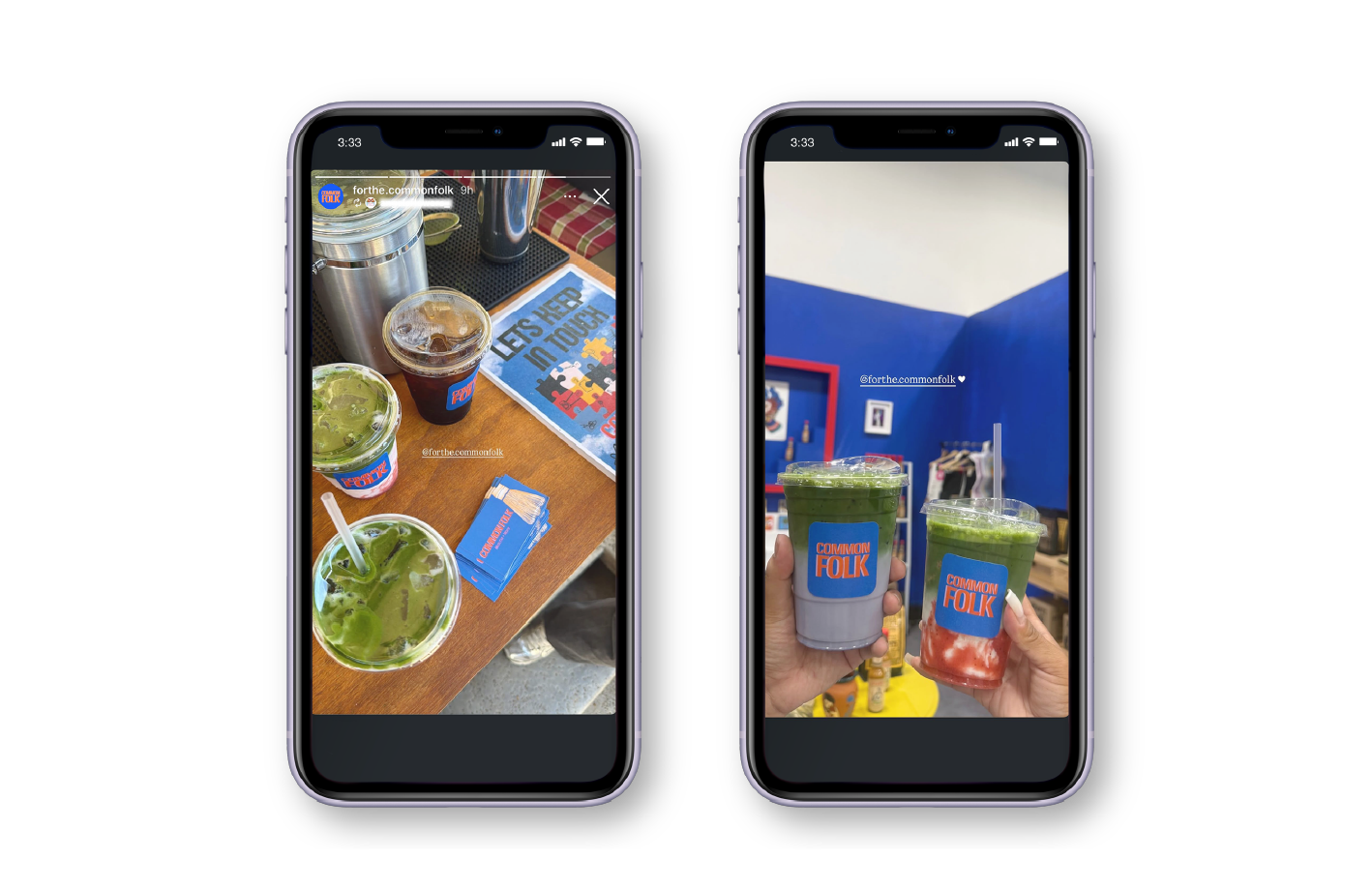
Social media story posts from customers during pop-up events in Santa Ana, CA.